Setting the scene
 I've often felt that 2000 AD has maintained a much higher standard of art than many of its american cousins. The merits of individual artists is always subject to debate, but I don't think it's a stretch to say that 2000 AD puts more effort in, probably because it can afford to. After all, each artist only has 5 pages to fill per week, as opposed to 22 per month (although it does work out roughly the same if you think about it...) What I'm getting at is 2000 AD to my mind has never been shy of filling up a nice background to its panels, and as a result nearly always nailing the atmosphere of a strip to perfection. And yes, I am saying that the srt on a comic is inherently better if you draw in a background as well as your main characters, even if you are trying to make a point by just drawing your heroes in macho poses the whole time (yes, Image founders, I'm looking at you)*
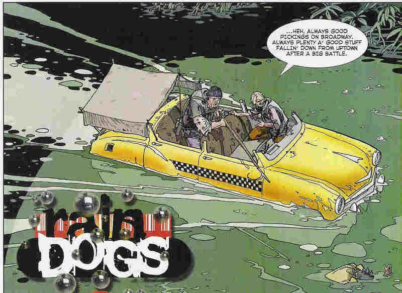
Take the above, for example. Now, Rain Dogs is no masterpiece (probably a post on why, one day). Frankly, it was a bit rubbish, but that opening panel from episode 8 might make you think otherwise. In an instant, you can see that we're in New York (from the taxi), there's been a major flood, and scavengers are the main players in this setting. That neatly sums up all the good bits of Rain Dogs, and it's beautifully illustrated to boot. It also does an excellent job of being a 'calm before the storm' panel. Some heavy duty action is just aroud the corner, after all...
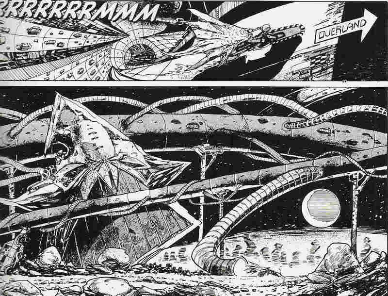
Here's another beauty from Henry Flint, very much in Kevin O'Neill mode (he also has a McMahon/Ezquerra mode, not to mention his own style, too):
 Just glorious, no?
In fact, I'm not here to talk about art. Rather, I'm interested in the idea of scene-setting. 2000 AD, as I love to try to prove, is a unique comic. All of its strips tap into some sort of atmosphere that is hard to define, hence the need for an infinite number of posts on the subject. But setting your story in the right time and place is definitely a big part of that.
On the one hand, the Rain Dogs panel shows you an economy of style that fills the reader in almost instantly. On the other hand, the panel from 'Deadlock', which shows the landscape of Earth several thousand years in the future (by which time it's called Termite), is an example of blowing your puny little mind. There is no frame of reference for this scene, and that's the beauty of it. I mean, I'm sure learned genre fans could point to influences**, but the average reader is simply given the sense that this story is in a weird place, with fascinating architecture that no-one would ever really build... would they?
And that ability to thrust readers into known yet unknown worlds is another of 2000 AD's strengths, one that founding father Pat Mills was especially good at.
But setting the scene isn't just about the art, it's about the characters, plot, and story, too. Here's a couple of opening captions to give you an idea:
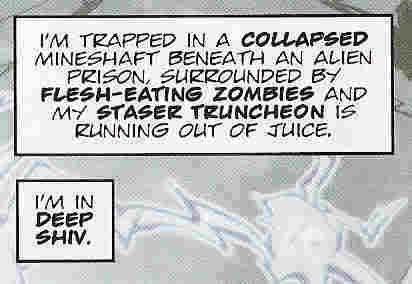
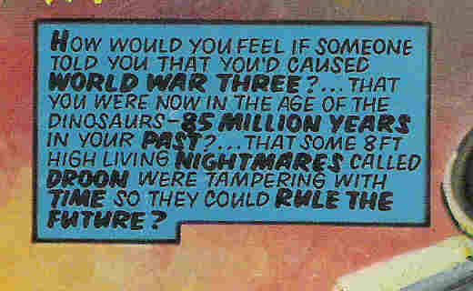 Now, these may not be much more than randomly thrown together Sci-Fi cliches, but the point is, that's just the opening caption for the ensuing five-page story. You're pretty much guaranteed that things will only escalate from here, probably with a handful of new ideas tossed in for good measure.
There's an old series from StarLord called 'Holocaust' that I only read for the first time a few months ago. The first episode was mildly entertaining, basically following a tough guy as he came to realise that aliens were invading - but no-one would believe him. This being a comic from the late 70s, I wasn't expecting much sophistication, so I thought the plot would unfold in a pretty straightforward manner, until this bit of exposition in the final panel of episode 1:
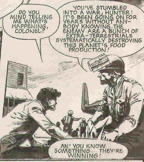
I mean, there's a whole nother 9 episodes of this bastard to go - and thanks to the 2000 AD (and sister publications) formula, it won't be 8 episodes of paranoia and frustration with a mild payoff, but 9 episodes of all-out war and other confounded expectations. Maybe not the best strip ever, but pretty exciting to this jaded 2000 AD reader. Better than Rain Dogs, anyway.
As well as foreshadowing the plot for an entire series, well-written exposition can also sum up a character neatly. Tanner from the Zero City cycle of strips is an old favourite of mine, although I get the impression that many other Squaxx weren't quite so keen, perhaps because of his overtly filmic credentials. Despite being the star of three series, we never find out much about who he is or where he came from - except this.
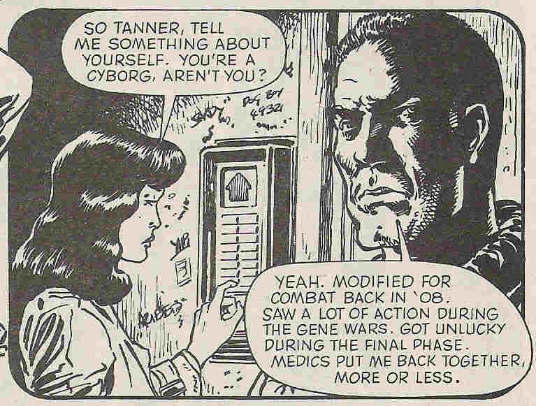 What else do we need to know? Back story out of the way in one panel, and we can get on with the story. Dave Stone would have done well to learn from this before launching his actually quite entertaining character Armitage into interminable strips about young Armitage. The first story was fine. He's hard and grumpy, the Brit-Cit justice is more liberal than Mega City One, but also more corrupt. We get it. Now tell some goddamn stories within that well-painted setting already. Sigh.
Sorry. Back to the point. When executed well, a simple scene setting panel or caption can really make a story into something special. Normally, 2000 AD does this rather well - with, naturally, a genre bent. Hence the title of this blog, which exactly the kind of caption you'd expect to find in the galaxy's greatest comic.
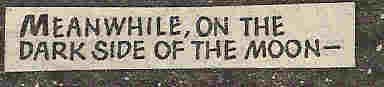 A Graphic Novel to the first person who can tell me which story it's taken from...
and grateful thanks to anyone who can tell me how to put it into the title box for the blog.

*OK, so mostly I'm griping at Liefeld, but the whole trend seemed to be so much about drawing cool-looking figures that there was never room to show where they were, and as a result many of those stories made no sense whatsoever.
**Obviously Flint is referencing O'Neill's designs from the original Nemesis stories, but where did he get his images from?
posted by alexf at 08:22
![]()
![]()


0 Comments:
Post a Comment
<< Home